Trout Priest - Art pass (as a treat)
We are at about 14 hours in, so I treated myself to some modelling! No more angry capsules! Now it's angry fish! And a proper Chapel to rest in, too!
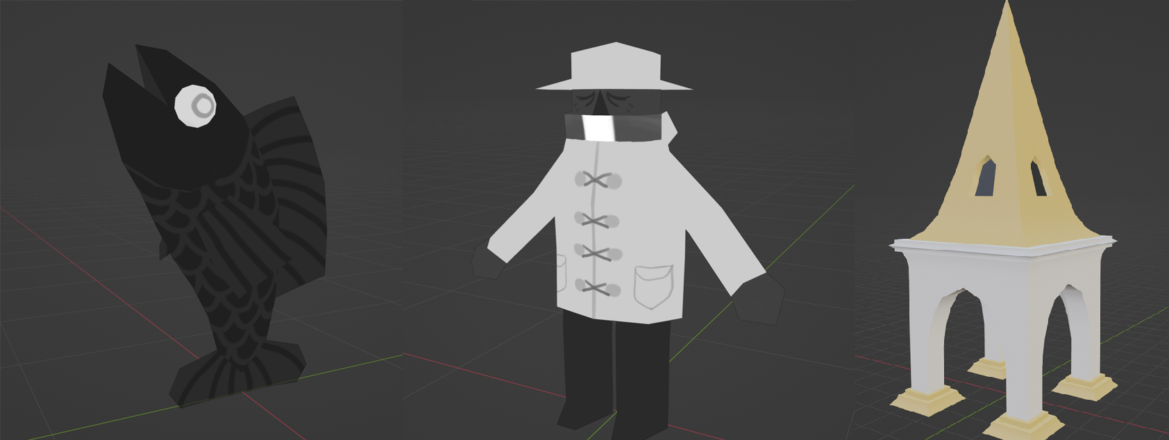
Still a rough first pass, but enough to get the idea across! I'm aiming for a lofi aesthetic, so If I run out of time, I don't think these are too far off the mark for "final" assets, at least for a quick project like this.
The Chapel will be getting some more work for sure. I spent a few weeks in Edinburgh soaking up the architecture, and so I have a lot of ideas for that!
The animations also add so much more life to the game! It's aliiiiive!
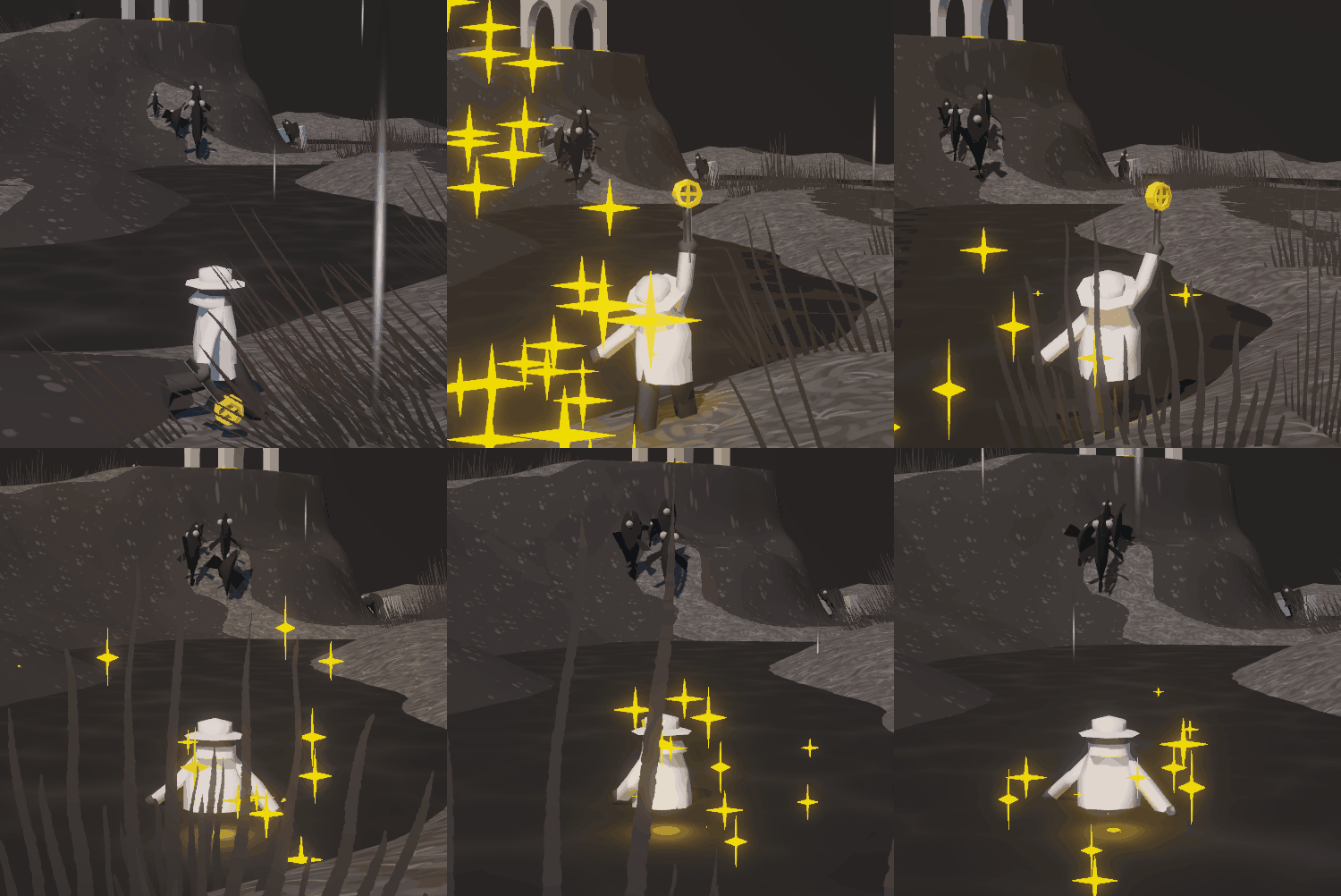
There is still some clipping with the coat, but I am very happy with this first pass!
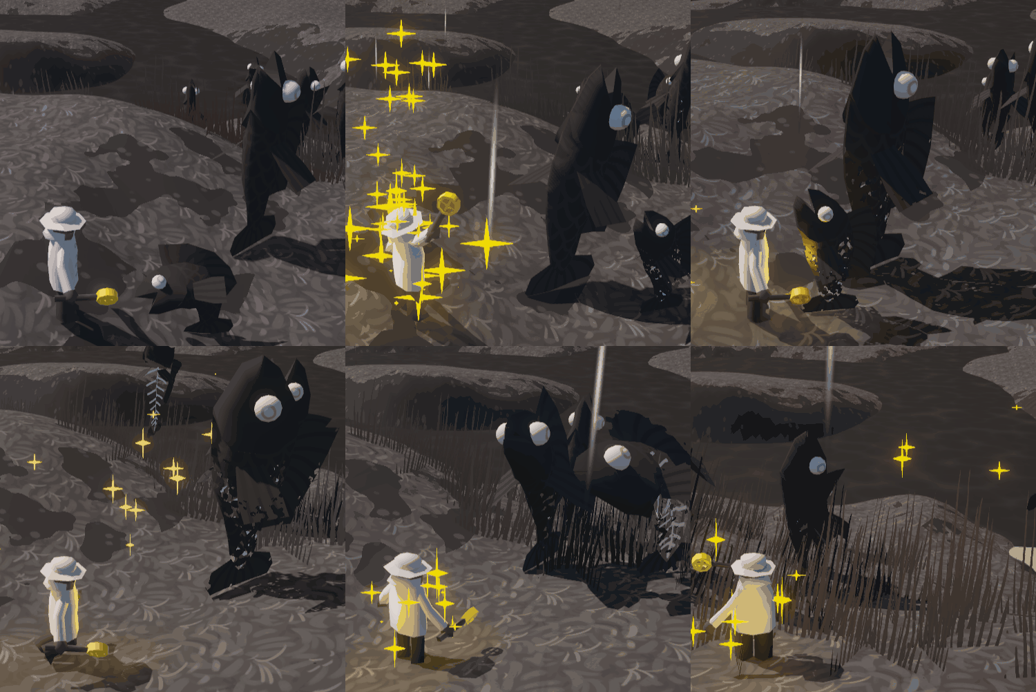
Fish also lose their flesh to show their remaining health. When it's just a skeleton, you can't do anymore regular damage and are definitely in need of Grace.
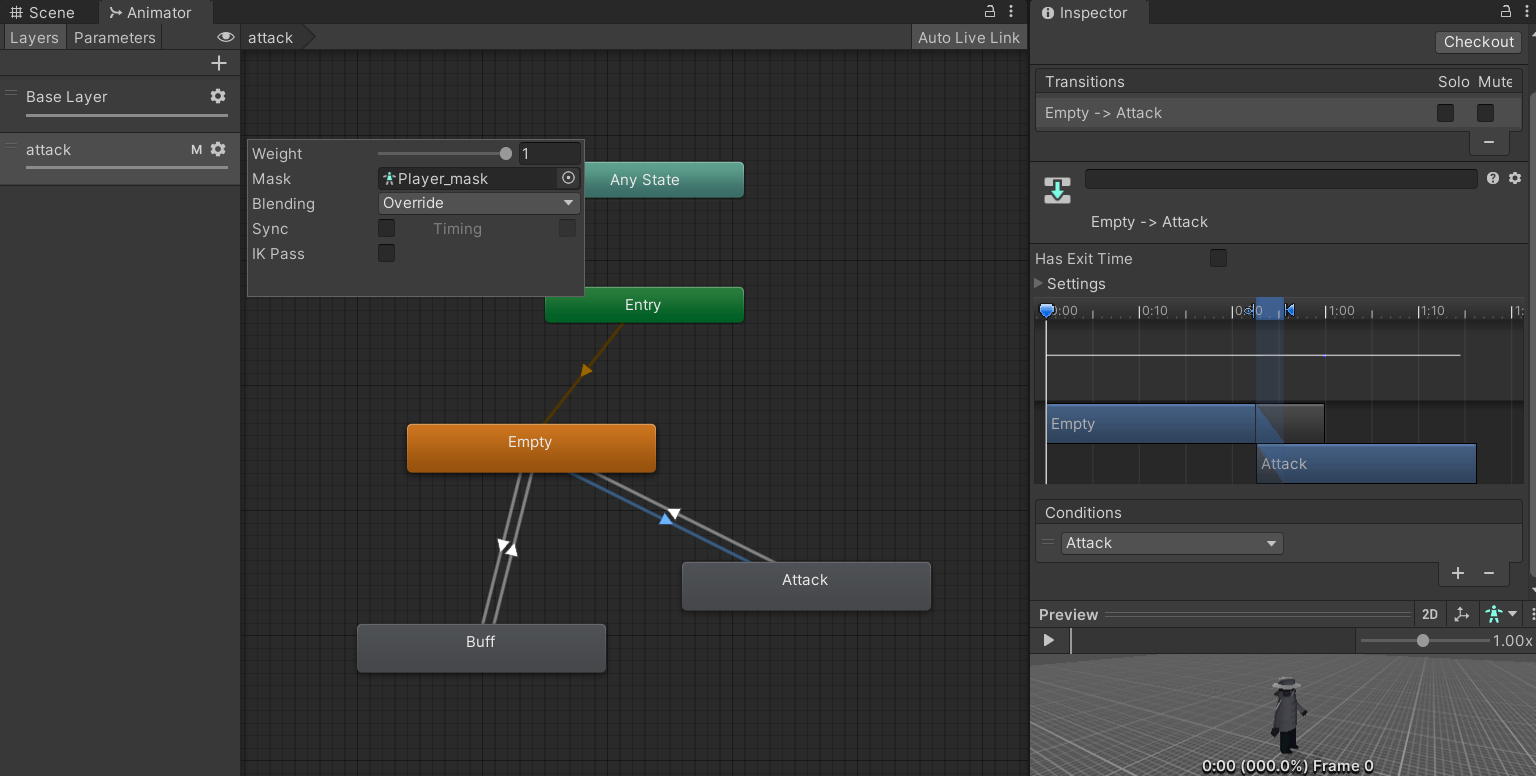
Wallace has a very basic animation layer system - the base layer controls the movement animation - and is just a blendstate based on how fast he is moving. The bonus with this is that when slowed in water, his animation is automatically slowed!
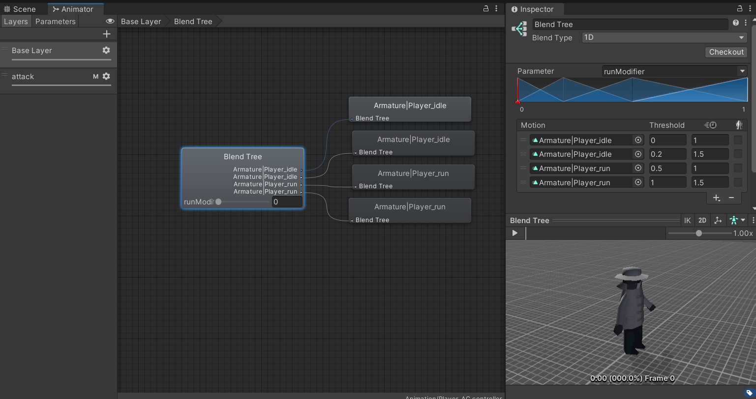
The attack layer controls the attack animation - this way the legs can continue moving and Wallace can strike and buff on the move! This is done using an Avatar Mask, which allows a layer to ignore certain bones in the skeleton. In this case, theAvatar Mask ignores any bones below the spine. The Empty state is just that, empty, so has no effect on the layer below.
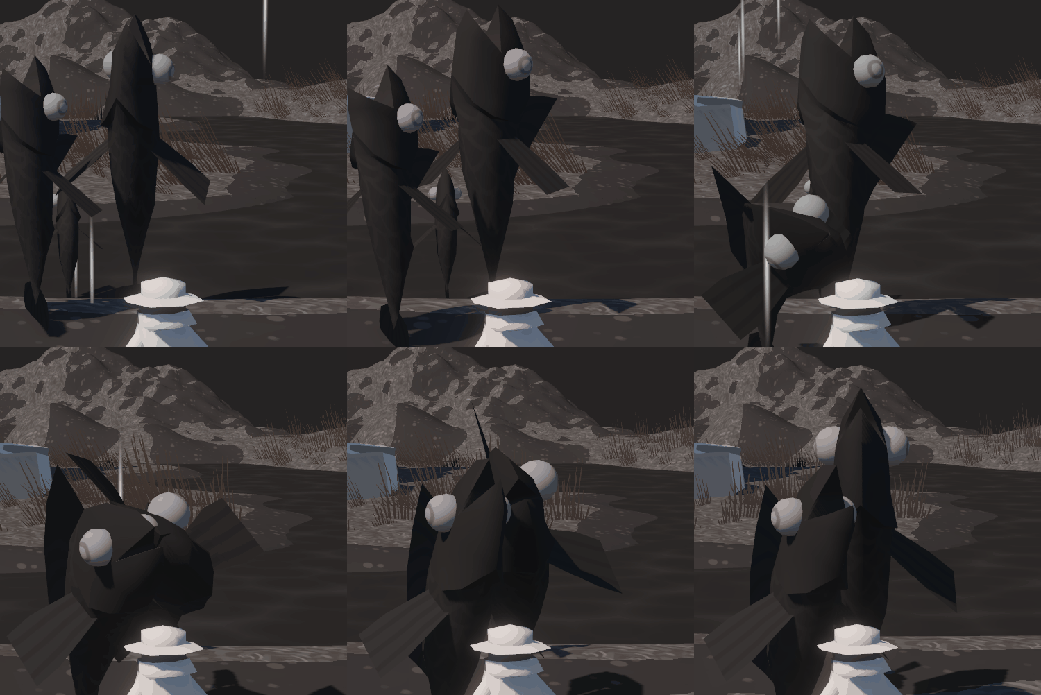
The enemies have an even simpler setup that isn't worth sharing, they loop their idle/walk until they attack, and repeat. I am, however, quite happy with their attack animation! All those Fromsoft games have given me a good sense for attack animations - really readable anticipation, almost instant motion, and then a satisfying overlap & settle back to idle. Sometimes I forget I spent many years as an animator, but I love getting the chance to do a bit where I can!
I am still working out Unity's grass system - it's way less sophisticated than Unreal's, but for now I've painted down some basic ones, though I have no idea why they are red, and not the same grey as everything else. There are some assets on the asset store to imitate the Unreal way of spawning foliage, but that might be out of this project's short scope.
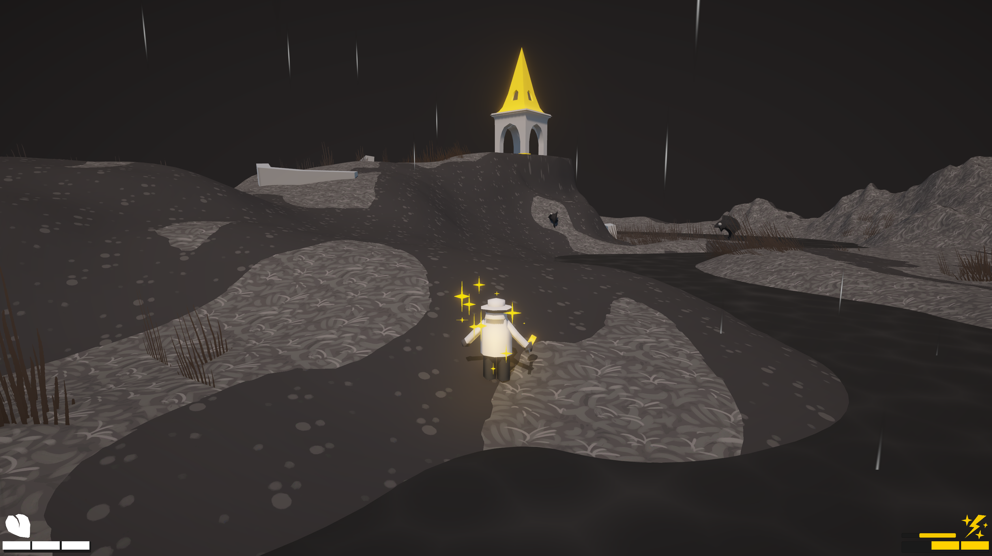
It all seems to be coming along nicely! Rain particles add some ambience too! Even the Grace particles have gotten some sprucing up, and a light comes on near the player when buffed to really sell the golden aura. If you listen to this .jpeg really closely, you might also hear the rain audio I added, too!
The audio setup is very basic - just playing an AudioSources when needed. Freesound.org and Kenny's Assets have been fantastic sources for quick 'n' dirty placeholders. I'm aiming to get some appropriately moody background music and proper sound effects done soon, too!
Trout Priest
Survive waves of undead trout as they crawl from the river, and lay them to rest.
| Status | Prototype |
| Author | Dan Emmerson |
| Genre | Survival |
More posts
- Trout Priest - Final Stretch14 days ago
- Trout Priest - The Chapel GardenAug 13, 2024
- Trout Priest - Navigating Navigation & First Round of PlaytestsAug 08, 2024
- Trout Priest - PlaytestingJul 31, 2024
- Trout Priest - Secondary mechanicsJul 30, 2024
- Trout priest - Heart and Grace improvementsJul 24, 2024
- Trout Priest - basic level & gameplayJul 22, 2024
Leave a comment
Log in with itch.io to leave a comment.